
Raley’s
Competing with giants like Kroger and Walmart, Raley’s needed more than price cuts — it needed connection. With just four designers, two copywriters, and a creative director (hi 👋), we built a system that made quality feel attainable, savings feel real, and everyday groceries worth celebrating.
CLIENT: The Raley’s Companies
Project Type
Creative & Art Direction
Photo & Video Production
Leadership
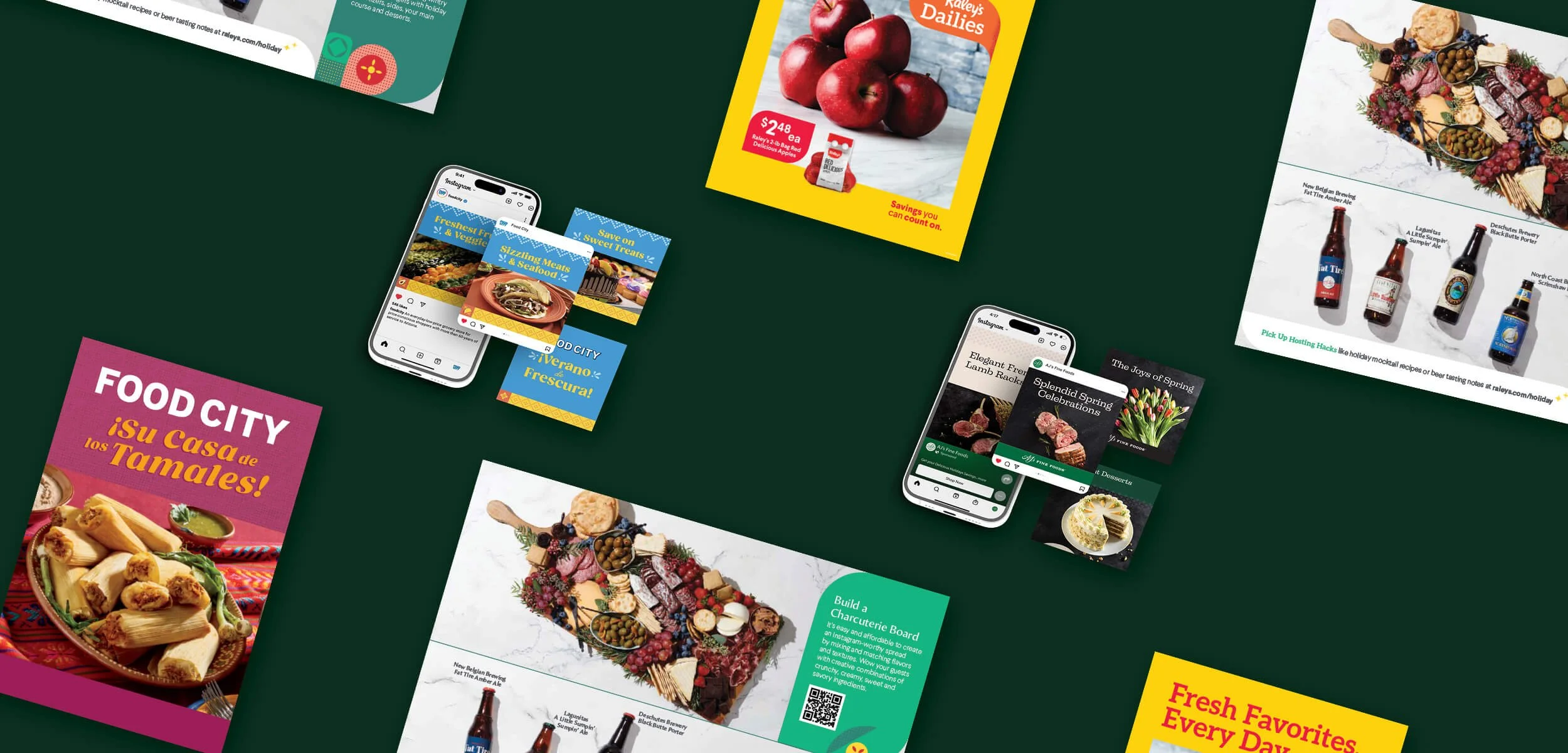
One Brand, Many Voices
Raley’s wasn’t one brand — it was five, each with its own voice, audience, and culture.
The goal wasn’t sameness, but harmony — one creative vision connecting them all.
Each brand had its own flavor — literally and figuratively.
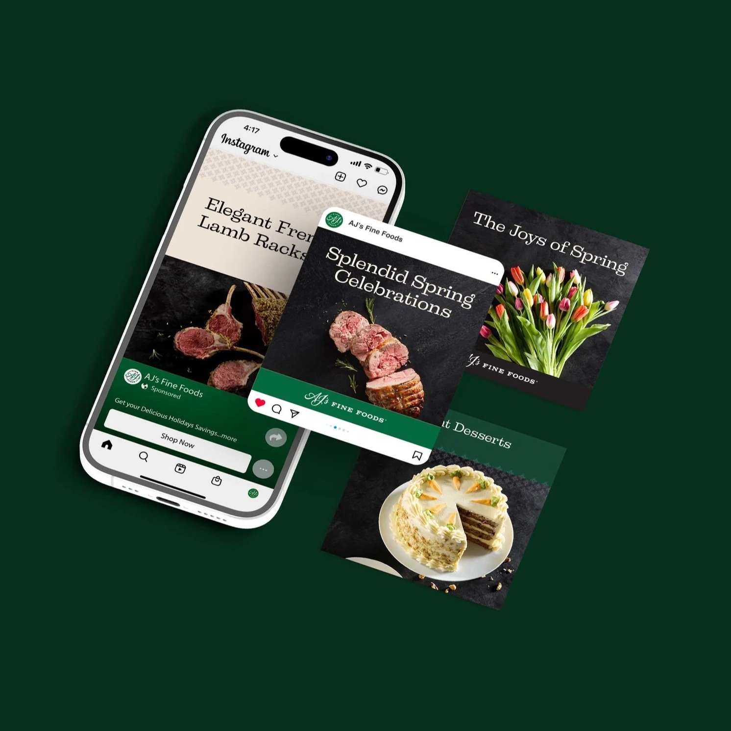
Raley’s and Bashas’ lived in the everyday grocery world, where value meets quality. Food City spoke to Hispanic communities through authentic, bilingual storytelling that felt like home. AJ’s Fine Foods celebrated the joy of small indulgences — think “everyday gourmet” rather than fancy for fancy’s sake. Bel Air and Nob Hill leaned into community and comfort, the friendly neighborhood stores that people grew up with.
To win hearts, our creative had to flex regionally and culturally. In Arizona, for example, grilling season starts in February, while Northern California leans into cozy, seasonal warmth. The system we built gave each region room to adapt, but within a shared creative language.
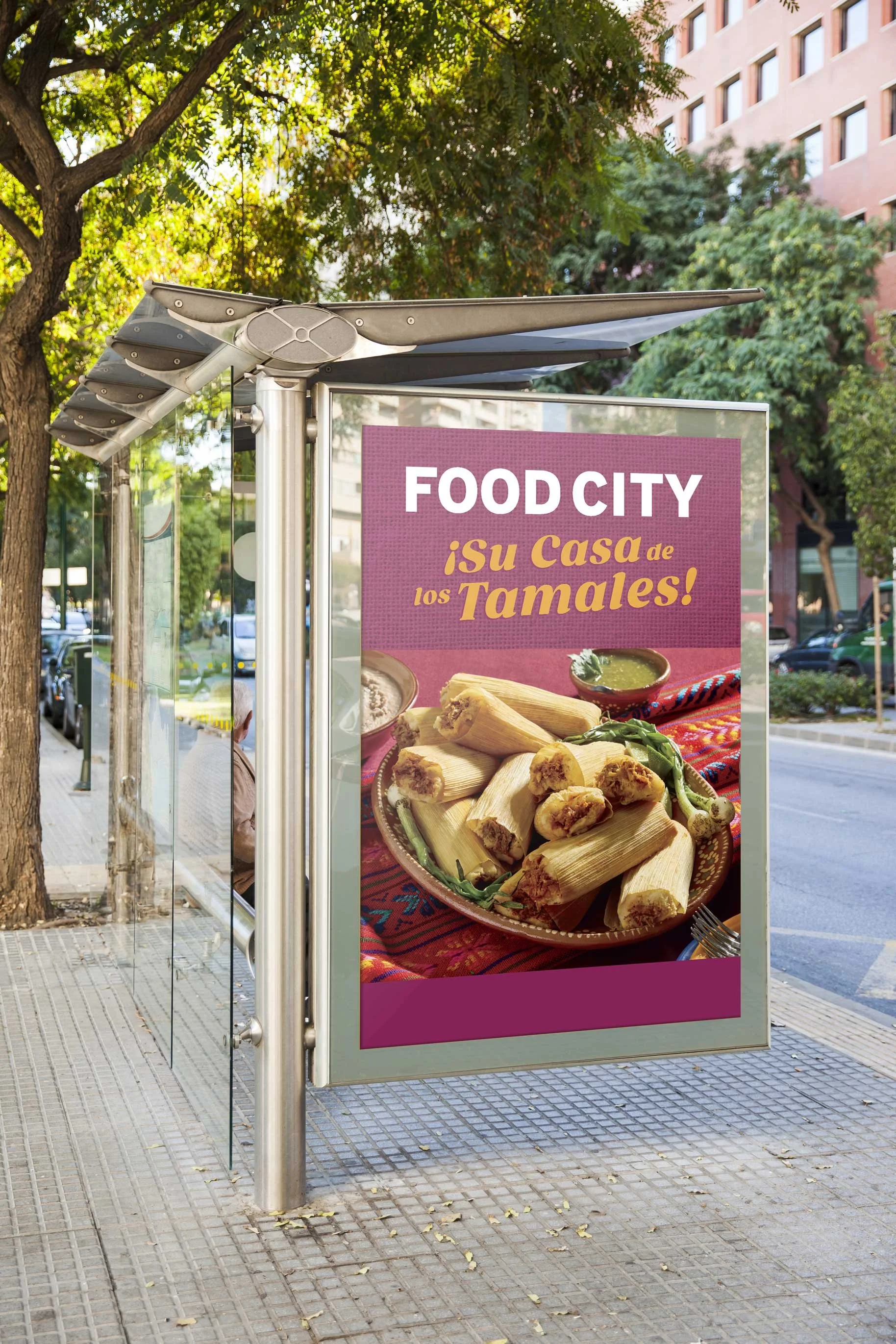
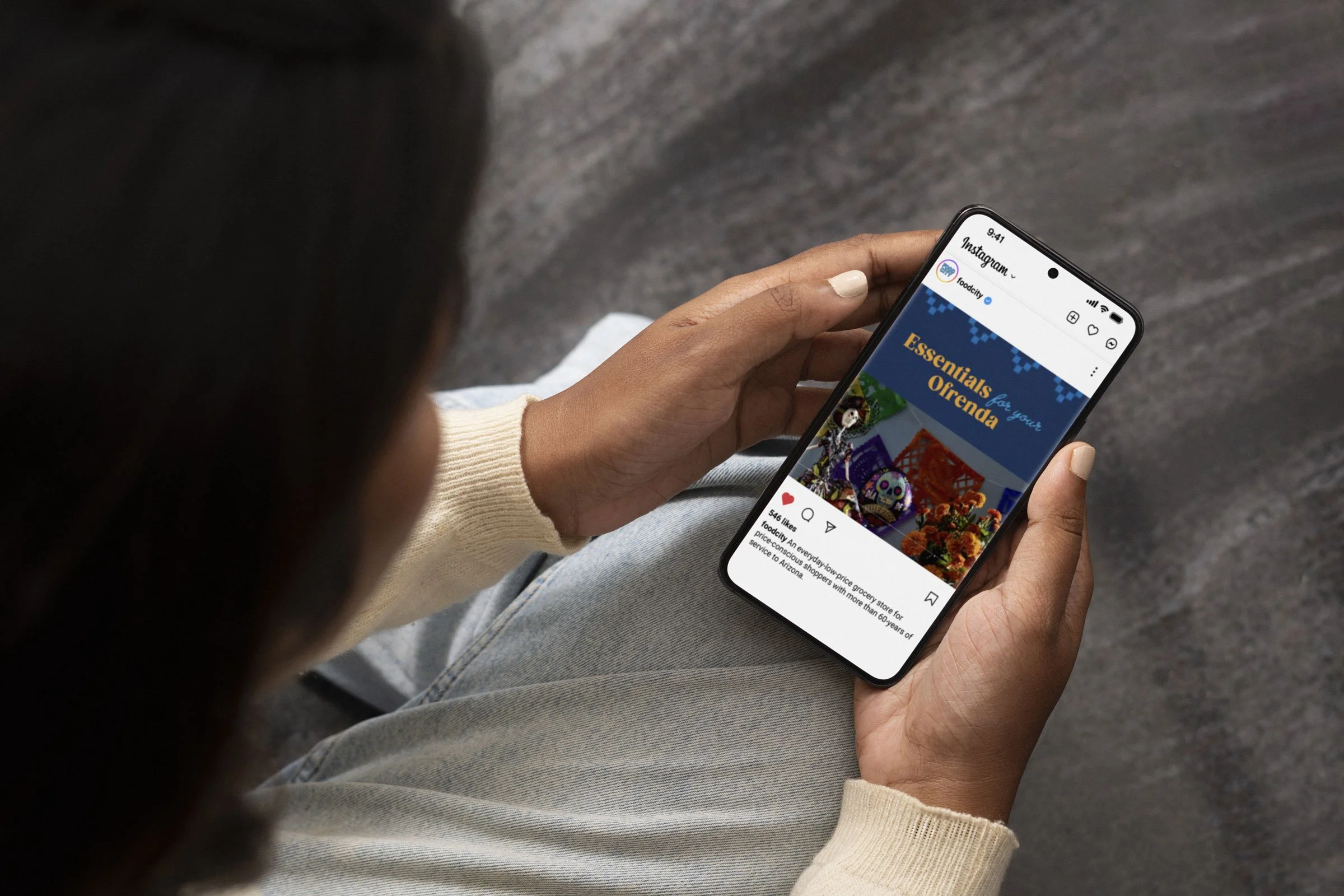
Authentic bilingual storytelling for Food City
Everyday gourmet for AJ’s Fine Foods
Community and comfort for Raley’s and Bashas’
The Approach
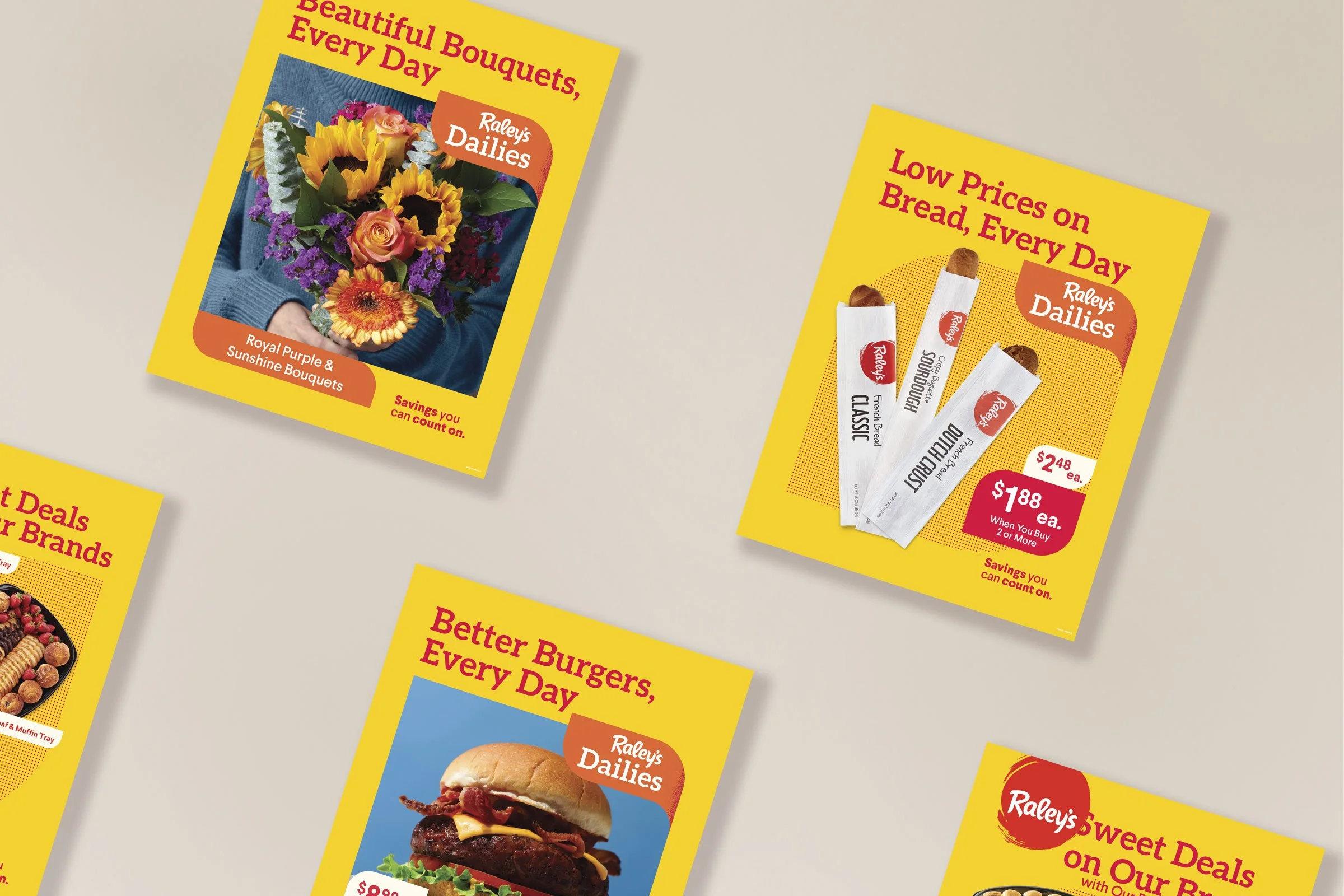
We built scalable systems that helped our small team deliver big: campaign playbooks, reusable photo libraries, and clear brand guidelines that aligned stakeholders across regions.
Our photography celebrated real life — cultural nuance, messy joy, and attainable quality. It flexed to reflect regional realities (Arizona’s grilling season starts in February!) while staying true to Raley’s broader vision.
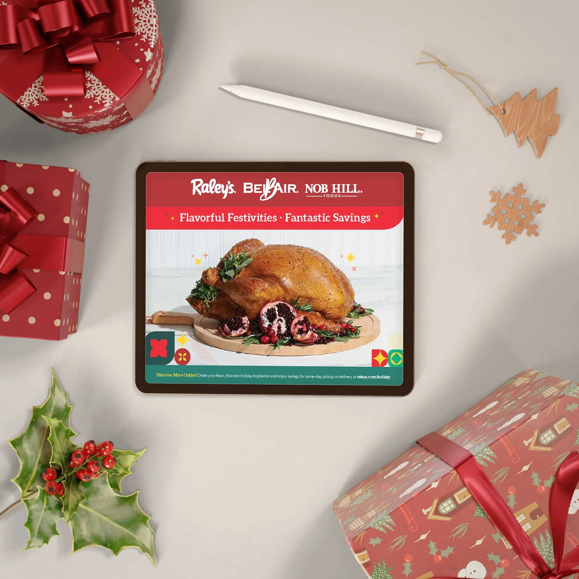
Holidays: A System for Celebration
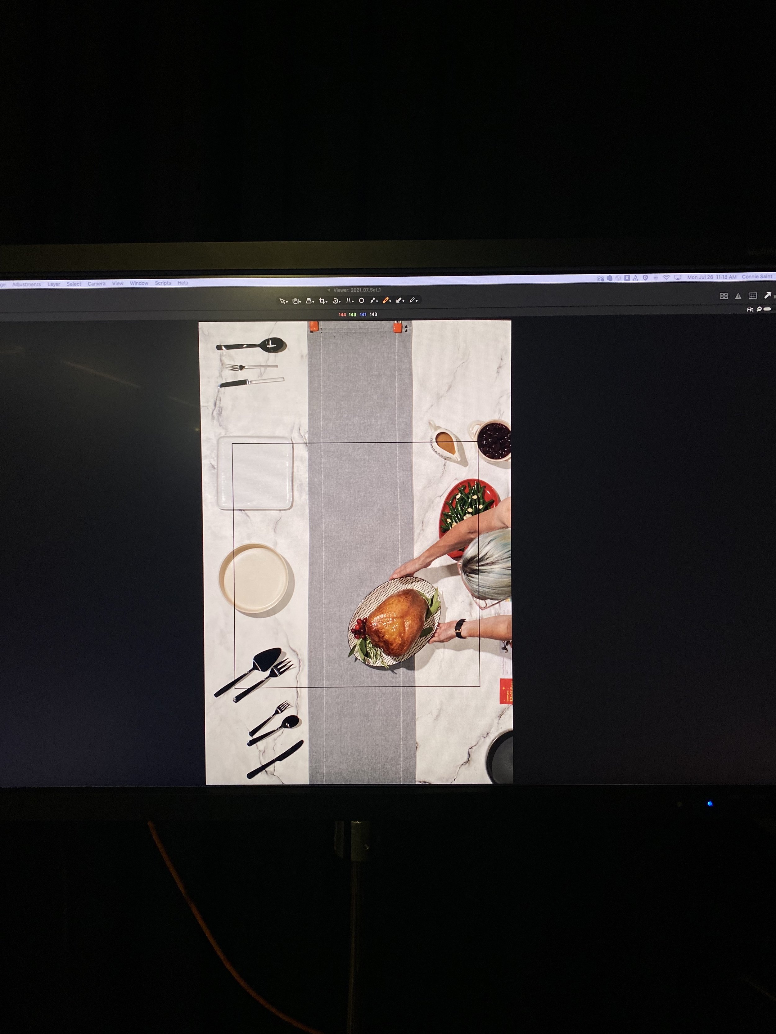
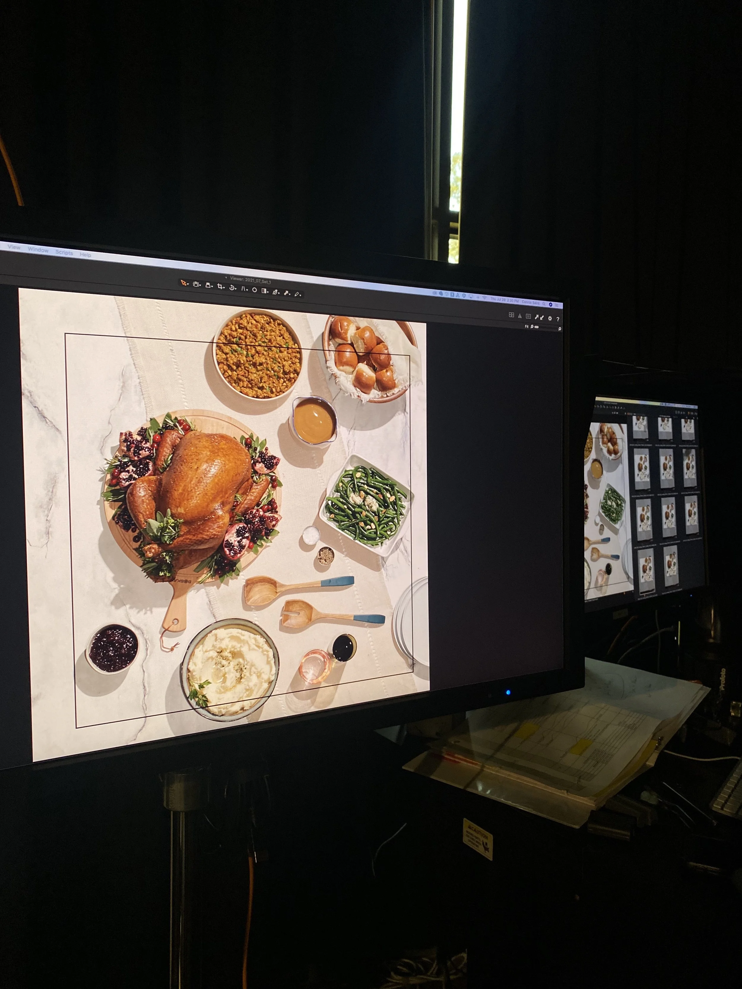
The holidays were when everything came together — quite literally. From Thanksgiving turkeys to Christmas cookie trays, every banner needed cohesive, timely creative — yet still true to its own flavor.
To keep things consistent (and my sanity intact), I built a seasonal campaign system that made celebration scalable. My team and I produced high-quality, versatile photography that could be refreshed each year with small updates — saving time, budget, and bandwidth while keeping everything visually fresh.
For Raley’s and Bashas’, that meant approachable warmth and value without losing the sense of quality. For Food City, it was about celebrating cultural pride through bilingual campaigns that felt authentic and rooted in community. And for AJ’s Fine Foods, it was the joy of gourmet moments made accessible.
By developing campaign guides, aligning visuals across in-store, digital, and paid media, and creating ready-to-use assets for future cycles, we turned what used to be chaos into a creative rhythm — one that let every team celebrate, not scramble.
What changed
Over time, our small team evolved into a creative engine punching far above its weight. We built seasonal photo libraries that could be reused year after year, saving budget and time. We established systems that reduced confusion, shortened turnaround times, and helped multiple banners launch campaigns seamlessly — from Easter to Verano to holiday.
Most importantly, we earned trust. Stakeholders began looping us in early. Shoots ran smoother. In-store experiences became more cohesive, especially at flagship locations like Raley’s ONE. And somewhere between the spreadsheets and the shot lists, we created something bigger than campaigns — we created a culture that respected both craft and humanity.
Because at the end of the day, even the most efficient system needs heart. And every strong creative team needs a leader who can make them laugh at 6 p.m. after the 20th turkey photo edit.